Is AB Testing Dead?

After Optimizely announced they were sunsetting their free plan as of February 28th the internet was abuzz with posts about “The End of AB Testing.” I’ll save the suspense now and tell you that “website testing” is absolutely NOT dead, but AB testing certainly has been in a slow demise due to neglect, not because of necessity.

A Tool’s Pricing Does Not Make A Tactic Worthwhile

Just because a tool may change its pricing structure does not necessarily indicate the demise of what it is solving. The argument goes that with new options such as dynamic ad and content targeting that you can no longer simply perform A vs. B tests. While that might be true of very large websites I can count on one hand the number of organizations I have talked to who are using such dynamic content on their sites. Furthermore, a decent majority of organizations I’ve talked to are not even doing simple A vs. B tests at all.

So Why Get Rid Of The Free Tier?

Optimizely runs a business. A business’s job is to make money. My guess is that offering something for free didn’t nearly net the revenue gains they were hoping for. Apple sold less devices, but gained revenue because those devices now cost more. LL Bean got rid of its lifetime guarantee because they were losing money on ‘shady’ returns. These do not indicate that people aren’t using cellphones nor do people no longer need to stay warm and dry. What it does indicate to me is that not enough people were using it. (There’s a Bears Ears simile in there somewhere unfortunately)

By Optimizely removing their free tier this should make every organization re-evaluate their testing strategy. Are you testing anything right now? If not then start looking at your conversion funnel. If it is converting any less than 90% then you should be testing ‘something’ inside it! If you are AB Testing and not doing dynamic content, well that is ‘YOUR’ next step. If you’re doing both, well there’s always room for improvement.

Is AB Testing dead? Well, maybe it has been dying a slow death, but not because it isn’t useful. Maybe it’s like the local gym… we all know we need to go, we buy a membership, we rarely go, then we cancel, then the gym loses money and we’re still out of shape. It’s time to get our website testing strategy back in shape! Let’s do this together >

The Chicken vs. Egg Strategy Approach

Not too long ago we were redesigning a website for a large hospital chain client. During the research phase of the project we reviewed the analytics to find that the ‘Locations’ page was nowhere to be found. We further dug into the numbers and saw that site searches for ‘locations’, ‘hours’, and ‘directions’ were quite high. In the qualitative research phase we talked with customer support specialists and determined that ‘locations’ type questions get asked a lot. Needless to say, when we created the user experience there was a ‘Locations’ link front and center!

Chicken Theory

“That’s just the way it’s always been done!”
This is often a tough one to overcome, especially in a large organization. Web analytics can help sway opinions, but you may have to do some digging. We would not have convinced the CEOs about putting such prominence of the ‘Locations’ link had we not dug deeper into the data. UX can, and should, drive user behavior. But bad UX can drive an undesired behavior and could lead you to make incorrect design decisions. Dig into your data and don’t just settle on the quantitative side. If something doesn’t make sense go deeper and collect more data sets. A developer once told me that he approaches things like a 5-year-old… just keep asking “Why?” until you reach a point where an answer emerges.

Egg Theory

“Hey, let’s bolt this feature on!”
Don’t do this! A strategy is a plan, and a failure to plan is a plan to fail. Bolting on feature sets without understanding how it fits within the larger digital strategy can be immensely harmful to user behavior. It can also wreck havoc on your analytics if it isn’t implemented properly nor tagged, as we discussed in our example. When new features are discussed they must be wireframed and discussed, determining how a real life user would actually use the feature. Oh, and obviously the big one… how will we track their behavior with this feature?

So which is it?

Well, it’s a combination of the two. It is important to think through new features and undertand how they fit into your site’s overall architecture and user experience (The Egg). However, it is just as important to learn from past behavior by asking the right questions and letting a mature site give you UX direction (The Chicken).

7 Data Driven Design Tools to Get Your Site Converting

Data-Driven design is the simple idea that the design of your website (product, etc) can benefit from being informed by both quantitative (ex: A/B testing) and qualitative (ex: User feedback) data.

That of course is the simple explanation.  As most of us know, simple ideas typically are followed by complex questions when trying to implement them into existing organizations.

Oli Gardner’s speech at MozCon 2017 (happening now, link to come!) and a 2013 article by Smashing Magazine titled “Data-Driven Design in the Real World” does a great job of answering the majority of those questions and is very much worth your time.

Knowing the difference between Quantitative and Qualitative Data is the first thing.  A great definition by Smashing Magazine is:

  • Quantitative data
    Numerical data that shows the who, what, when and where.
  • Qualitative data
    Non-numerical data that demonstrates the why or how.

So, great, where do I get this data from then?  I’m glad you asked.

Quantitative Data-Driven Design Tools

This list assumes you’re already using an Analytics platform such as Adobe SiteCatalyst, Google Analytics, etc.  If you’re not, then you should definitely start there.

The below are a list data-drive design toolsets designed to gather quantitative data for your design strategies.  The vast majority of these are not surprisingly, Website Testing platforms (A/B, Multivariate) and provide real data on what design updates perform better on a numerical basis.

Unbounce

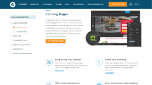
Unbounce Landing Page Testing

With a focus on split testing testing campaign landing pages, Unbounce provides incredibly useful data that can help improve the design of your campaign landing pages.  Better yet, it easily integrates in to most paid advertising workflows by giving you a singular landing page URL to use for advertising platforms like Google AdWords and others.

Optimizely

Optimizely A/B Testing

While Optimizely used to be a very similar product to other website A/B, multivariate testing platforms like Visual Website Optimizer, recently Optimizely has begun to broaden their offering into mobile app, engagement and more.  However, Optimizely at it’s core is built as a design optimization tool and does that job well but can be a bit daunting to a newcomers given the complexity of it’s toolset.

Visual Website Optimizer

Visual Website Optimizer

Visual Website Optimizer and Optimizely offer a lot of similar features but where VWO shines is in it’s ease-of-use compared to Optimizely.  While it may lack a few of the features and deeper complexity that Optimizely has begun to add, VWO keeps to what it does best which is user-friendly website optimization.

Google Optimize

Google Optimize A/B testing

Google Optimize is the latest iteration of Google’s Content Experiments and Website Optimizer products and by far it’s best showing.   While similar in features to VWO and Optimizely, where Google Optimize shines is its integration with Google Analytics and their focus on making their toolset incredibly user friendly.  For those with Analytics 360, Google also offers a similar Optimize 360 level of product.


Qualitative Data-Driven Design Tools

UserTesting

User Testing

A popular user testing platform, User Testing allows you to create simple or complex user tests with strict qualifying questions to ensure that those providing feedback closely match your desired buyer personas and demographics.  As well, User Testing has a very clear ranking system for testers to encourage them to given quality, relevant feedback to your tests.

Usability Hub

Usability Hub Testing

Usability Hub straddles the divide between Qualitative and Quantatitive data given it’s product offerings and their individual focuses but is a powerful tool when your design decisions are more specific.  Offering user-testing that focuses on navigation, click tests and first impressions, it’s one of the more comprehensive Qualitative data-driven design toolsets.

Five Second Test & Question Tests (Usability Hub)

5 Second Test 

While a recent addition to the Usability Hub suite, I felt the 5-second Test warranted a separate mention given it’s incredibly simple and powerful premise.  With a focus on simply recording a user’s first impression of a design, the 5-second Test has been a long favorite of UX and Usability professionals when trying to get quick, simple user feedback for a potential design.


How to Focus on Landing Page Content that Converts

When most people hear Conversion Centered Design, it’s common that their first thoughts go towards layout, imagery, design psychology and the hierarchy of your landing page’s copy.

However, what most often gets overlooked is whether the copy on the page that is optimized for conversion as well.

X tips on landing page content that converts

Create clear rather than clever landing page copy

As with most campaigns, you want your campaign to stand out and avoid being sterile and lifeless.  Yet, often in the race to be witty, landing page copy can become obtuse and generic, creating confusion for visitors and accidentally replacing your Value Proposition with superlative jargon.

This doesn’t mean your copy needs have the spirit of a toaster manual, it simply means that the key elements in your content’s conversion hierarchy should make it as easy as possible for a visitor to determine the unique value and campaign proposition you’re providing.


landing page copy example 1

The above example is clear in what it is offering (free landing page tutorial) and the value the product provides (helps users understand key concepts about building a landing page).

Unbounce Dejargonator Chrome Extension

If you’re looking for a quick scan of superlatives and jargon, Unbounce has created a Chrome extension called the Dejargonator designed to identify fluffy copy that’s worth installing.

Unbounce Dejargonator

5 Second User Test Your Landing Page

Once you have your landing page content to converting level of clarity, it’s worth investing time to see how clear it is to potential users.  When you know your company, your products and services and the goals behind your campaigns, it’s hard to be objective when reviewing whether your landing page copy is clear.

Tools like Usability Hub allow you to create 5 Second User Tests to bring objective data to determine if users can quickly determine things like:

  • What does your product do?
  • How much is your service?
  • What is that you’re offering them?

Quick feedback like this can offer real data on whether your campaign’s landing page copy is clearly communicating critical information or not.

A/B Test Which Landing Page Content Converts

ab testing landing page copy to convert

Landing page copywriting shouldn’t be “set and forget”.  While a starting foundation is important, iterating on that foundation is critical.


The important part with creating landing page copy that converts is to make it a major part of your conversion optimization plan.

Want to learn more about making clear landing page content?  Unbounce has a great examination of how increase conversions by using clarity in your landing page copy.

How to run simple AB testing programs with Google Analytics

AB testing can sound daunting at times. I suspect this is why so many organizations have yet to conduct much testing of their own. So in the light of the new year and resolution setting here’s to a 2017 full of ab testing!

Step number one of AB Testing: Plan

We have already discussed what to ab test previously, but once you have that idea you need to enact a plan to implement it. For our article we’re going to assume that you’re testing easy things, such as button colors or page layout changes. These are typically easy things for a marketer to do within their content management system and it’s the first place to start when dipping your toe into the AB testing game. Here are some quick things to keep in mind:

  • Start with small and easy changes
  • Consider starting with either a page at the end or beginning of your conversion funnel
  • Have one or two page variations, but no more than that

How to setup an ab test in Google Analytics

Setting Up Google ExperiementsOnce you create an experiment you have a bunch of quick and easy settings to get you up and running. If you already have goals set up in GA (and if you don’t call us immediately) you can select them via a dropdown for your test conversion. Then, you must decide if you want all traffic to the original page to be part of the AB test or just some. We would typically recommend just doing 100%. In the Advanced Settings we would advise when you’re first starting to distribute traffic evenly across all variants. When Google starts deciding, especially with low volume, it can get wacky very quickly. For example, at 100 sessions, if the Original saw 25 conversions and Variant 1 saw 15 Google would start showing Original more often. But 10 conversions isn’t hard to make up and in our example it’d be just 10% of the sessions!

The next step is implementing your page variants. It’s as simple as entering the URLs of the pages. So the Original URL is the page as it currently exists and the variants are your competitors. It’s literally that simple. Once you enter these pages and click “next” Google Analytics will give you code to place on the Original page. There are tons of different content management systems out there, but for WordPress you can simply edit the header.php file:
google experiments in wordpress
…Or you can use a plugin such as Simple Content Experiments. Again, your content management system should have some sort of way to implement the GA Experiments code in the head tag somewhere, just ask your development team.

That’s it for implementation. If you want to do simple AB tests any marketer with a good CMS could have a test up and running in a matter of hours. So what then are you waiting for? Get to testing and watch your website conversions skyrocket!

What The 2016 Election Taught Us About User Research

The 2016 presidential election has come and gone. We won’t get into politics here, but I think we can all agree it was a shock that Donald Trump was able to overcome what seemed to be a large gap. But the question many have been asking is, did the gap really ever exist? Did anyone bother to ask rural America how they might be voting? This is a huge issue within many businesses as well. When was the last time you ‘polled’ your audience? When was the last time you asked your customers what they wanted? This user research is paramount to a an optimized marketing and website experience.

Customer Surveys

Conducting a survey is one of the easiest types of user research around. It’s easy to use a survey tool, such as Survey Monkey, to ask your customers what they may want to see out of your business offerings or website experience. We’ve seen the most success when surveys are short, maybe 3-5 questions, but try to never go above 10 unless you are providing some kind of offer.

Old Fashioned Talking

It’s ok to reach out to customers every once in a while to get a sense of how they feel about your brand. This one-on-one user research method can be focus groups or a simply phone call. The act of holding the conversation goes a long way with customer and audience trust. The most important thing that comes from it is that customers feel a part of your business, galvanizing their support for your brand!

Usability Testing

You’ve probably heard of AB Testing, but its cousin is Usability Testing and a really great way to use user research to get real time feedback of abandonment points on your website. Usability testing is where a moderator will walk audiences through processes or site sections to see how easy it is to perform actions on your website or compare them to a newly proposed alternative. After about 5 participants the answers start to repeat so you could do this exercise in as little as 10 total work hours.

These are all just a few ways you can connect with your audience for very little investment. If you’re interested in understanding your audience in more detail and optimizing your website accordingly contact us by filling out the form on the right hand side of this page (or below on mobile!).

What should I AB Test?

Having trouble deciding what to AB test?

Here is a fun list of potential things you can test on your website:

Commerce Sites:

  • Add to Cart button text/color
  • ANY page within the payment process (look for form requirements or distractions)
  • Product listing page layout and filter options
  • Product page layout
  • Image(s)
  • Text length
  • Reviews

Lead-gen Sites:

  • Form requirements (eg: do you have to require certain fields)
  • Form titles
  • Field order
  • Steps vs. No Steps

Content Sites:

  • Search results or article list page layout
  • Article page layout
  • Related links
  • Comments section
  • Lots of images vs. none
  • Amount of content OR section headings

There are virtually hundreds of things you could test on your website without needing to involve a designer nor a developer. By focusing on little things you can keep costs low, or even non-existent. All you need is a testing platform and you could even use the free service from Google Analytics called ‘Experiments’. Just start testing! Once you’ll start you’ll be amazed at how even the smallest variations can have huge impact to your conversion!

Don’t be scared of AB Testing

AB testing sounds much more difficult than it actually is. It’s probably because designers, developers and marketers just don’t want to be proven wrong so they just muddy the water. At the base of it all, AB testing is about getting answers about your website from those who actually use it.

Bluefin Strategies quick definition of AB Testing: Testing multiple variations of a web page to see which one drives to more conversions

Potential things to test with AB Testing:

  • Button colors on Calls to Action (CTAs)
  • Content voice or length
  • Page layouts
  • Image types, or no images at all
  • Feature additions

Implementing an AB test is as simple as:

  1. Deciding what to test
  2. Developing variations
  3. Implementing the variations
  4. Beginning the test
  5. Analyzing the test

The strategy behind an AB Test is essential to ensuring its success. There may be times when test variations don’t beat out what is currently active today, but more times than not you will see conversion increases with every test. The BIGGEST thing to remember is that you aren’t redesigning your entire website, just changing bits and pieces. This means you see conversion gains quicker and cheaper than you would by waiting for a site redesign. Talk to a Bluefin Strategy consultant about the benefits of AB Testing and how a small investment can go a long way!